Good maps don’t just show people where something is—they invite them to explore why it matters.
Some of the most effective storytelling I’ve been part of didn’t rely on words alone. It relied on place — on helping audiences understand where something was happening and what it meant in relation to them.
That belief is what led me to treat interactive maps not as visual enhancements, but as editorial tools — equally valuable in moments of crisis and moments of curiosity.
Maps Are About Orientation, Not Just Information
In digital storytelling, geography often provides the missing context. Audiences aren’t just asking what happened. They’re asking:
- Where is this happening?
- How close is it to me?
- Can I explore this myself?
Interactive maps answer those questions intuitively. They let users move at their own pace, follow their interests and build understanding without friction. That’s true whether the story is urgent — or simply engaging.
Public Service in Breaking News Coverage
In breaking news, emergencies and public safety situations, interactive maps became essential.
They allowed us to track wildfires, weather, infrastructure disruptions and unfolding incidents across neighborhoods. Instead of presenting information as a series of disconnected updates, maps offered a single, reliable point of reference.
But the real power came from how those maps were designed.
Turning Maps Into Living Story Timelines
In breaking news situations, maps weren’t static visuals — they were living story environments.
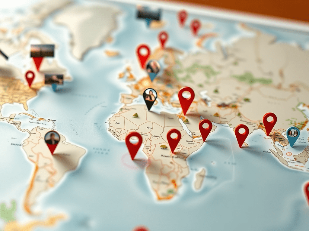
Each marker served as an entry point into deeper context. As readers clicked or tapped, they could access:
- On-the-ground photos
- Short video clips
- Verified updates and timestamps
- Resource links and official guidance
As events evolved, markers were added or updated, allowing the map itself to function as a geographic timeline.
Rather than forcing audiences to jump between articles, social posts and external sources, the map brought the entire story together in one navigable space. Readers could explore developments at their own pace, return for updates and orient themselves visually as situations changed.
The result was less confusion, deeper engagement and—most importantly—greater trust during moments when clarity mattered most.
Scaling This Approach During COVID-19
This philosophy scaled during the COVID-19 pandemic.
Interactive maps and dashboards helped localize case data, surface public health guidance and connect users to critical resources. Combined with timelines, links and explanatory context, mapping became a way to translate overwhelming information into something usable and human.
The goal was never traffic. It was service.
Maps Beyond Breaking News: Lifestyle and Entertainment
Some of the most engaging interactive maps I worked on had nothing to do with emergencies.
We used mapping to support lifestyle and entertainment storytelling, helping audiences:
- Explore new restaurants, neighborhoods and destinations
- Track celebrity sightings and filming locations during major movie productions
- Navigate cultural events and community happenings
These maps invited exploration. They turned stories into experiences, allowing readers to click, zoom and discover at their own pace.
In these cases, maps answered a different set of questions:
- Where can I go?
- What’s happening nearby?
- How do I experience this myself?
That shift—from passive consumption to active participation, extended the life of stories and strengthened audience connection.
Designing With Restraint and Purpose
Across all use cases, my philosophy remained consistent:
- Clarity over complexity
- Function over flash
- Accessibility over novelty
Every map had to earn its place. If it didn’t help users orient themselves, explore meaningfully, or make informed decisions, it didn’t belong.
This discipline ensured interactive maps enhanced storytelling rather than distracting from it.
Collaboration Makes Mapping Work
Effective interactive maps don’t happen in silos.
They require editorial judgment, technical fluency and close collaboration between journalists, designers and developers. As a leader, my role was often to bridge those disciplines—ensuring accuracy, usability and consistency across platforms.
That collaborative, purpose-driven approach helped elevate interactive mapping from one-off experiments into a repeatable storytelling strategy, one that has been recognized externally as an example of effective digital journalism innovation.
Why Interactive Maps Still Matter in an AI Era
As AI-generated content becomes more prevalent, interactive maps remain uniquely human-centered.
They demand:
- Editorial choices about relevance and emphasis
- Ethical judgment around sensitivity and accuracy
- An understanding of how people explore information visually
Algorithms can process location data. They can’t decide what context matters to a community.
Maps slow audiences down in productive ways. They invite curiosity, understanding and agency—qualities that are increasingly rare in automated content environments.
The Leadership Lesson
Interactive maps succeed when leaders:
- Invest in tools with clear purpose
- Empower teams to experiment responsibly
- Treat usability as a form of respect
- Recognize that innovation can be playful as well as serious
Whether helping people navigate emergencies or discover something new in their city, interactive maps build trust by meeting audiences where they are.
And trust — earned through usefulness — is the most powerful metric of all.
